I'm Daniel Park. I review monitors for creative work, the 4K, ultrawide, and color-accurate panels that designers and video editors actually buy, and I spend a lot of my time staring at Delta E numbers. In this guide I'll walk you through monitor color calibration for your home office using nothing but the tools already built into Windows and macOS, then tell you exactly when it's worth stepping up to hardware.
In a Hurry? Start Here
- Fix the basics first: native resolution, a 30-minute warm-up, and matching your ambient light do more than any slider.
- Target 100 to 300 nits, gamma 2.2, and a 6500K white point: use the sRGB preset if your monitor has one, and lower brightness until white looks like paper.
- Night mode is comfort, not a cure: the blue-light evidence is thin, so treat Night light and Night Shift as a sleep aid, not an eye-strain fix.
- Skip the colorimeter unless you edit photos or video, design for print, or need two monitors to match. Aim for a Delta E under 2.
Table of Contents
Disclosure: TechDeskZone is reader-supported. When you buy through links on our site, we may earn an affiliate commission at no additional cost to you. See our affiliate disclosure for details.
You unbox a new monitor, plug it in, and the whites look blue, the blacks look gray, and your eyes are tired after an hour. Most setup guides skip the reason: your monitor did not ship calibrated for your room. It shipped set to look punchy on a showroom floor. Max brightness, a cool blue white point, contrast cranked to sell the spec sheet.
Before you start: three things that matter more than the settings
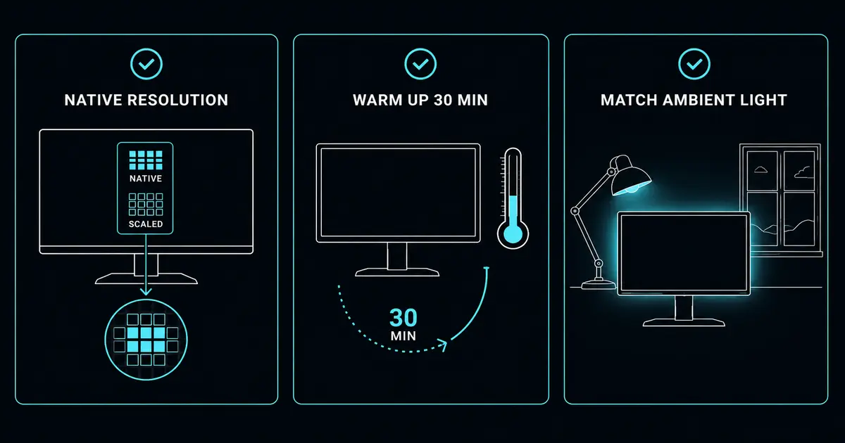
Three setup steps do more for a home-office monitor than any slider, and they cost nothing.
Set native resolution first. If your panel is running below its native resolution, everything is soft no matter how well you calibrate it. This matters most on high-density displays where Windows scaling or a bad cable defaults you to a lower resolution. I covered the trade-offs in my guide to 1080p vs 1440p vs 4K for office work. Set the resolution to native, then calibrate.
Warm the panel up. A cold backlight has not settled, and the internal lookup table (LUT) drifts while the display warms. HP recommends letting a monitor warm up for at least 30 minutes before you do critical color work. If you calibrate a cold panel, you are measuring a moving target.
Match your ambient light. Calibrate in the light you actually work in, at the time of day you usually work. A monitor tuned in a dark room will look wrong under daylight, and the reverse. If your room changes a lot between day and night, pick the condition you work in most and accept the rest.
Step 1: Brightness and contrast
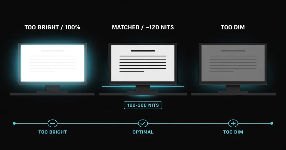
The single biggest home-office mistake is running a monitor at max brightness. A display set to 100 percent brightness is doing two things: it is washing out black levels, and it is pouring more light into your eyes than the room can handle.
BenQ puts office and general use at roughly 100 to 300 nits, and notes that a monitor producing light above what you need can cause eye strain. For reference, VESA’s DisplayHDR documentation puts the standard dynamic range mastering target at 100 cd/m², which is another way of saying 100 nits. Your monitor should roughly match the brightness of the wall behind it, not the sun.
How to do it: open the on-screen display (OSD), lower brightness until a white page looks like paper instead of a light bulb, then set contrast to around 75 percent and fine-tune against a grayscale test pattern. EIZO’s free Monitor Test runs a gradient and a gamma check in the browser, which is enough to see whether your blacks are clipping. If black text on a white background looks like it is glowing, you are still too bright.
Step 2: Gamma and color temperature
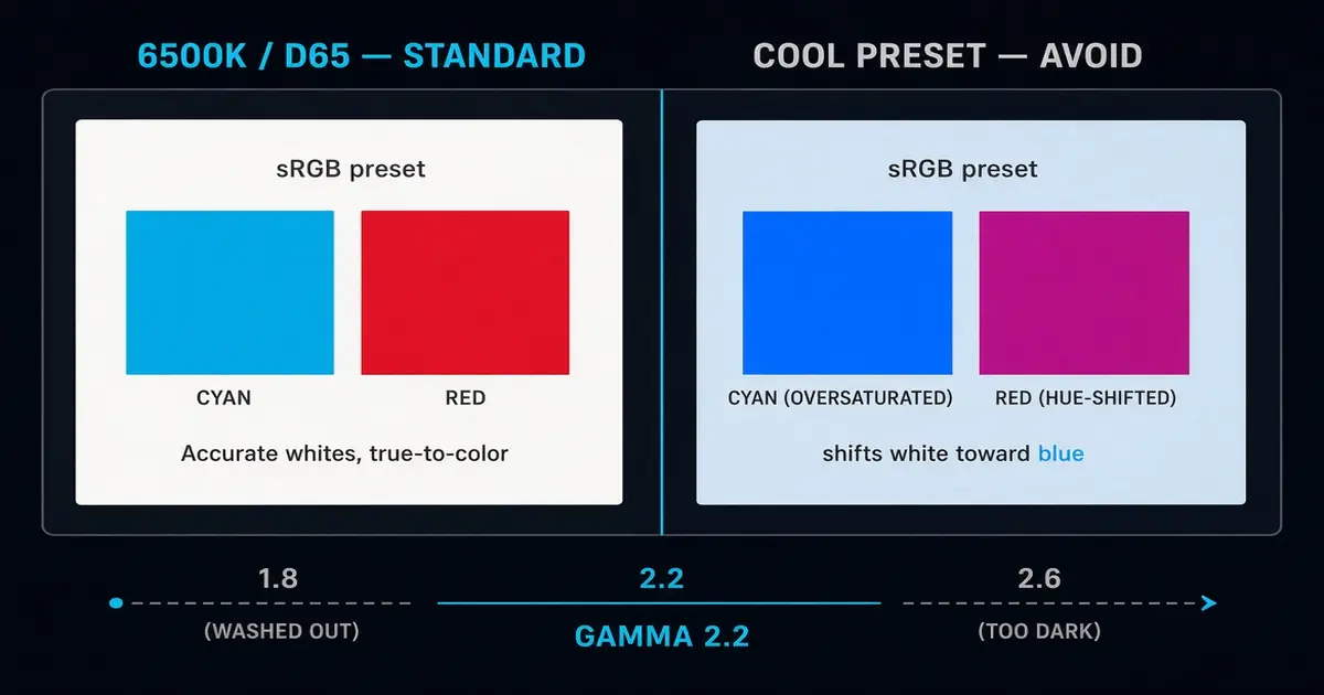
These two settings are where most factory monitors go wrong, because the defaults are tuned to look vivid rather than accurate.
Gamma describes how the display maps input signal to light output. A gamma of 2.2 is the standard for sRGB, photography, graphic design, and the web, per the IEC 61966-2-1 sRGB specification. Gamma 1.8 looks washed out and flat; gamma 2.6 looks too dark and contrasty. If your monitor has a gamma option, set it to 2.2.
Color temperature sets the white point. The sRGB standard (IEC 61966-2-1) defines white as D65, which is roughly 6500K. A monitor’s “Standard” or “sRGB” preset is usually the closest to 6500K. Avoid the “Cool” preset, which pushes blue, and the “Vivid” or “Game” presets, which oversaturate color to look impressive on a shelf.
Your panel type also caps what you can achieve here. A VA panel shifts color and contrast when you view it off-angle, which no setting fixes. I broke down which panel technology suits which kind of work in my IPS vs VA vs OLED comparison. If color accuracy matters to you, the panel comes before the calibration.
Night mode: comfort, not a cure
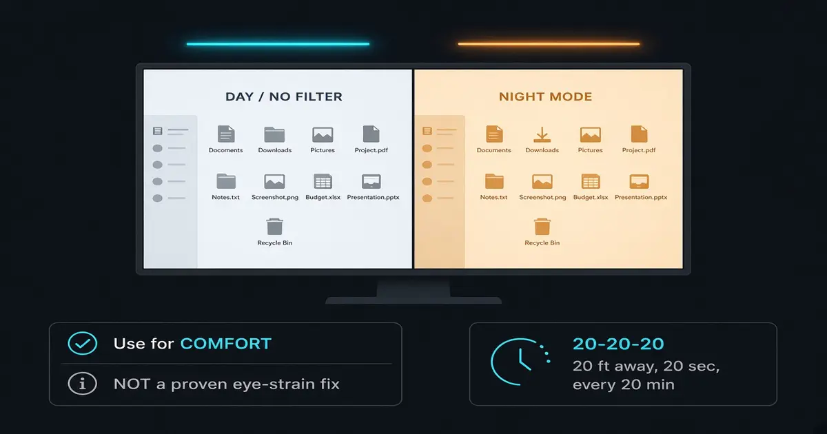
Digital eye strain is real. More than 65 percent of U.S. adults report at least one symptom, burning or tired eyes, dryness, headaches, or blur, according to figures compiled by Vision Center. The part most guides get wrong is what actually helps.
The evidence for blue light being the culprit is thinner than the marketing suggests. A 2023 Cochrane systematic review of 17 randomized trials across six countries found that blue-light-filtering lenses probably make no difference to eye strain, eye health, or sleep. Screen blue light is also far less intense than sunlight. The American Academy of Ophthalmology notes blue-light exposure from screens is much less than from the sun.
So here is the honest framing. Night mode, Windows Night light and macOS Night Shift, is a comfort feature, not a medical fix. It shifts the white point warmer, which many people find easier to look at in a dark room and which reduces blue exposure before bed. Use it for that. But the interventions with real evidence behind them are matching brightness to your ambient light and the 20-20-20 rule, looking 20 feet away for 20 seconds every 20 minutes. Lowering brightness does more for tired eyes than any blue-light filter.
Step 3: Run the OS calibration wizard
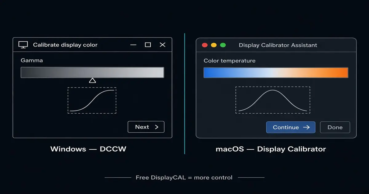
Both operating systems ship a free calibration tool, and both adjust the operating system’s LUT rather than the panel itself. That is a meaningful distinction. A software calibration corrects how the OS sends signal to the display; it cannot fix a panel with poor native color, uneven backlight, or the wrong color gamut.
Windows: the tool is called “Calibrate display color” (also known by its old name, DCCW). Search for it in Settings, then follow the gamma, brightness, and contrast wizard. It writes an ICC profile for your display.
macOS: the Display Calibrator Assistant lives under System Settings, Displays, Color. It walks you through a similar set of steps and saves a profile.
Both: if you want more control without spending money, the free DisplayCAL software gives you finer grained targets than the built-in wizards.
These tools fix brightness, gamma, and white point at the software level, which is enough for documents, spreadsheets, email, and web browsing. They cannot give a wide-gamut monitor the right color space for print, and they cannot fix a panel that was built to a low color standard. If accuracy is a priority, choose a monitor with good color specs in the first place.
Do you need a colorimeter?
For most home-office work, software calibration is the end of the line, and that is fine. Hardware calibration matters when you edit photos or video, design for print, or need two monitors to match each other. This is where my workday lives.
Hardware calibration uses a colorimeter, a small device that sits against your screen and measures what it actually emits, then writes a correction directly to the display’s hardware LUT. EIZO notes that real hardware calibration needs a 10-bit or higher LUT per color. The mainstream tools are the Calibrite Display Pro HL, the Calibrite Display Plus HL (which Calibrite specs at up to 10,000 nits, useful for HDR), and the Datacolor Spyder X2 Ultra.
The number to know is Delta E, written ΔE. It measures how far a displayed color sits from the reference color. PerfectChroma’s color-science guide breaks the scale down this way:
- ΔE under 1 is imperceptible, the professional reference standard.
- ΔE of 1 to 2 is barely perceptible, acceptable for most professional work.
- ΔE of 2 to 3 is noticeable to a trained eye: fine for general office work, not acceptable for color-critical work.
- ΔE over 3 is clearly visible and not suitable for color-critical work.
EIZO frames it this way in its factory-report guidance, and Fstoppers describes an average Delta E under 2 as “good” and under 1 as “excellent.”
Color gamut is the other half. PerfectChroma estimates sRGB covers roughly 35 percent of visible color, enough for web and documents (figures vary by measurement standard). Adobe RGB runs about 50 percent, adding the greens and cyans that print needs. DCI-P3 runs about 45 percent, adding the reds and yellows used in video. Rec. 2020 runs about 76 percent and is the aspirational target no consumer monitor fully reaches. A home-office worker only needs sRGB. Buy a wide-gamut monitor only if your workflow actually consumes that gamut.
If you do step up to a colorimeter, recalibrate on a schedule. EIZO recommends calibrating about once a week until a new panel stabilizes, then about once a month. HP suggests every one to three months. Panels drift as they age, so a calibration is a snapshot, not a permanent fix.
The 60-second checklist
- Set the monitor to its native resolution.
- Let the panel warm up for 30 minutes.
- Lower brightness to match your ambient light (roughly 100 to 300 nits for an office).
- Set gamma to 2.2 and color temperature to 6500K, using the sRGB preset if you have one.
- Run the OS calibration wizard, Calibrate display color on Windows or Display Calibrator Assistant on macOS.
- Use night mode for comfort, not as an eye-strain fix.
- Reach for a hardware calibrator only if you do color-critical work or need two monitors to match.
Calibration is not a one-time event. It is a habit you repeat when your panel ages, your room changes, or you swap displays. Get the free stuff right first, and the expensive tools only when your work demands them.
Sources
- EIZO, “Colour Management and Calibration: Factory Report.” https://www.eizo.eu/colour-management-and-calibration/factory-report (Retrieved 2026-08-22)
- EIZO, “Color Management Library: Calibration.” https://www.eizo.com/library/management/color-management/02.html/ (Retrieved 2026-08-22)
- EIZO, “Monitor Test” (gradients, gamma, sharpness). https://www.eizo.be/monitor-test/ (Retrieved 2026-10-13)
- Fstoppers, “Monitor Specs Decoded: sRGB, Adobe RGB, DCI-P3, and Delta E.” https://fstoppers.com/gear/monitor-specs-decoded-what-srgb-adobe-rgb-dci-p3-and-delta-e-actually-mean-photo-721641 (Retrieved 2026-08-22)
- PerfectChroma, “Color Science Basics.” https://perfectchroma.com/resources/color-science-basics-2/ (Retrieved 2026-08-22)
- BenQ, “Choosing a Monitor with the Right Brightness (Nits) Value.” https://www.benq.com/en-us/knowledge-center/knowledge/choosing-a-monitor-with-the-right-brightness-nit-value-for-you.html (Retrieved 2026-08-22)
- HP Tech Takes, “How to Calibrate Your Monitor.” https://www.hp.com/us-en/tech-takes/monitors/maintenance/how-to-calibrate-monitor.html (Retrieved 2026-08-22)
- Cochrane, “Blue-Light Filtering Spectacles Probably Make No Difference to Eye Strain, Eye Health, or Sleep.” https://www.cochrane.org/about-us/news/blue-light-filtering-spectacles-probably-make-no-difference-eye-strain-eye-health-or-sleep (Retrieved 2026-08-22)
- Vision Center, “Digital Screen Impact Statistics.” https://www.visioncenter.org/resources/digital-screen-impact-statistics/ (Retrieved 2026-08-22)
- VESA, “DisplayHDR Performance Criteria.” https://displayhdr.org/performance-criteria/ (Retrieved 2026-08-22)
- IEC, “61966-2-1:1999, Multimedia systems and equipment, default RGB colour space (sRGB).” https://webstore.iec.ch/en/publication/6169 (Retrieved 2026-10-13)
- Calibrite, “Display Plus HL.” https://calibrite.com/us/product/display-plus-hl/ (Retrieved 2026-08-22)
- RTINGS, “Monitor Color Accuracy Testing Methodology.” https://www.rtings.com/monitor/tests/picture-quality/color-accuracy (Retrieved 2026-08-22)
- American Academy of Ophthalmology, “Should You Be Worried About Blue Light?” https://www.aao.org/eye-health/tips-prevention/should-you-be-worried-about-blue-light (Retrieved 2026-08-22)
The Verdict
Bottom line: Free OS calibration handles nearly every home-office complaint, brightness, gamma, and white point. A colorimeter only earns its cost when color accuracy is the point of your work.
Quickest fix: Set native resolution, warm the panel 30 minutes, then drop brightness until a white page reads as paper and pick the sRGB preset. That is 90 percent of the improvement in five minutes.
Best permanent fix: Re-run the built-in calibrator every few months, and only add a Calibrite or Datacolor colorimeter if you edit photos or video, design for print, or need two monitors to match.
← Back to Guides Hub